Introduction:
The purpose of this exercise will be to develop maps based on microclimate data collected from the surrounding UW- Eau Claire campus. This data was collected by several different teams of students and pooled in order to build maps with a larger scope of the campus.A microclimate is used to note the climatic changes of a relatively small area. But even within a small area man-made and geomorphic features cause variations in weather variables.
A gallery of weather variables was developed and built into domains and exported to our Trimble Juno GPS unit in a previous exercise. Now, measurements for these variables will be recorded on a mobile weather station/GPS unit to connect them with spatial locations. Once collected, this data will be transferred to ArcMap where various maps can be produced in order to display the weather variables and variations within our microclimate (the UWEC campus).
Methods:
Data CollectionThe Trimble GPS Unit (as seen in Figure 1) containing the domains for our weather variables was use to record measurements and notes based on our field observations. Because each variable is measured in different units, this unit, equipped with pre-set units for each field, allowed us to move as quickly as possible from point to point.

Figure 1: This visual displays a Trimble Juno GPS unit used for collecting field data.
A Kestrel Mobile weather station (as seen in Figure 2) allowed us to collect weather observation data such as wind speed, temperature, dew point and relative humidity. 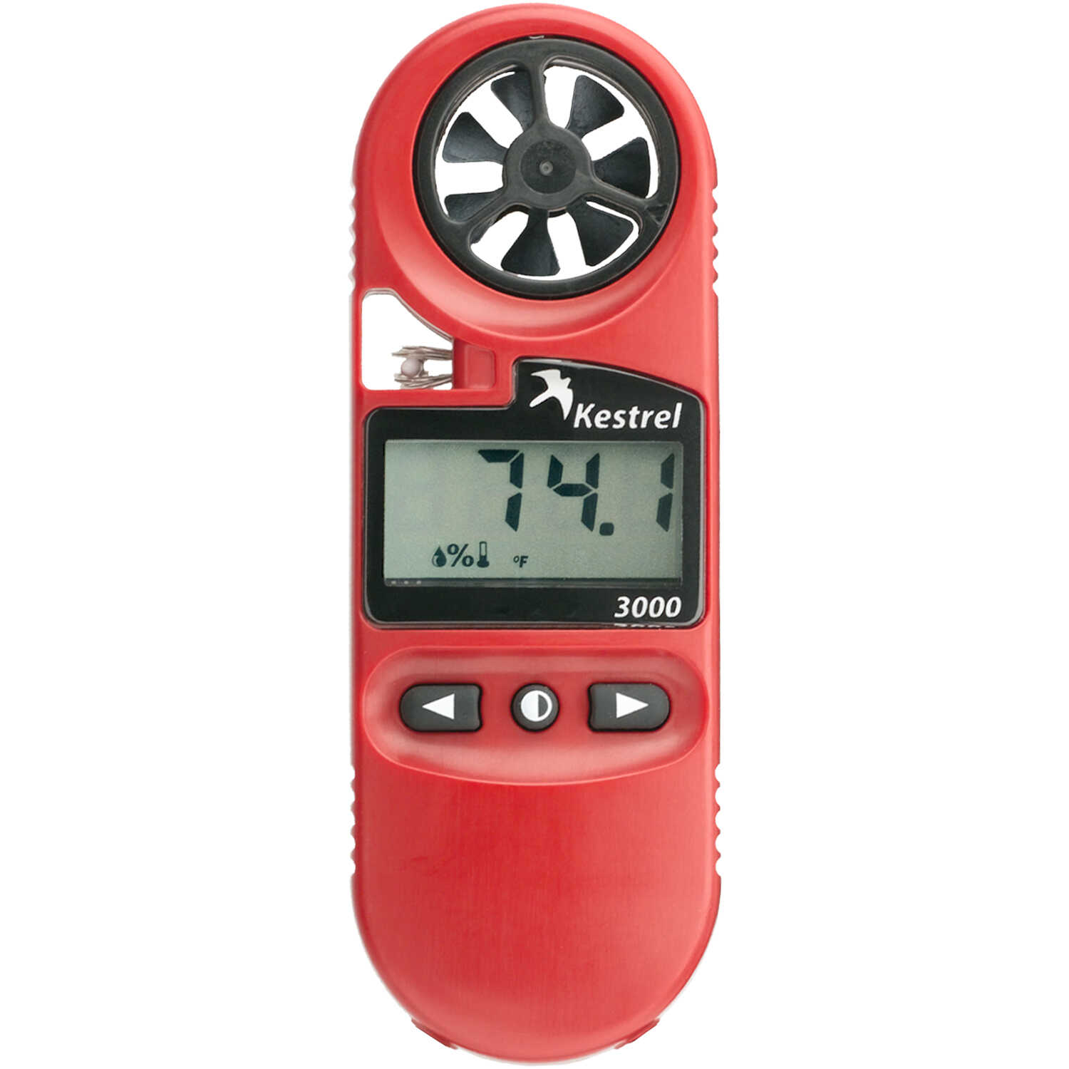
Figure 2: This visual displays a Kestrel Mobile Weather Station for collecting weather variable data
Data Transfer
After data collection, the data from each team with their various points and microclimate data were merged into one feature class (as seen in Figure 3). While this would ideally be a very easy problem, we hit a snag at this point of the exercise because we had failed to coordinate our attribute table headings.

Figure 3: This map shows the collected point from each team combined into one feature class
Within the merge tool, a field map was used to categorize the different input headings that recorded the same category of data from each group. This made it possible to combine them into one output. To avoid error, we merged the data from one group at a time. This allowed us to avoid the confusion of trying to assure every category was matched properly for seven groups at once.
From there, it was possible to develop maps using interpolation methods offered through ArcMap to
effectively display the data. These methods include spline, kriging and inverse distance weighted (IDW) among others. An entire suite of interpolation methods and their explanations allow users to experiment with and understand the best usages for these methods.
One other problem arose when a few data points were actually locate near the Equator. These points were simply deleted allowing raster design to proceed.
Results/Discussion:
Temperature Map
First, I produced a map of temperature data (as seen in Figure 4). I did not find the original results of the IDW interpolation for temperature to be particularly illuminating. In an effort to try to produce something better, I manually adjusted the class breaks. I chose to use a lot of classes because there really isn't that much differentiation between most of the temperature data outside of a few outliers. This way, I wouldn't be overstating the temperature difference around campus. I am happy that temperatures under 32 degrees stayed in the relatively blue classes on the map. It might seem like an aberration to have values between 45 and 80 degrees when most other values are hovering around 32 degrees. This was due to temperature recording at a point directly beneath a heat vent.

Figure 4: This map shows the temperature variation recorded on the UWEC campus
Wind Speed and Direction MapThe next variables I interpolated were wind speed and direction (as seen in Figure 5). Using the IDW interpolation on wind speed, I again adjusted the class breaks and applied a single color scheme to help identify where wind speed is increasing more easily.. The trick of this map was how to allow readers to ascertain both variables at the same time. I wanted to indicate the direction of the wind while still allowing them to see the wind speed beneath. I chose to symbolize wind direction with a hollow arrow and adjusted the direction of the arrow based on the direction in the symbolization menu.
I almost made the huge mistake of not pointing my arrows the way the wind is heading which is exactly opposite of what you record when determining wind direction. Luckily, I caught my blunder and made the adjustment. Initially, I wanted to only include one arrow in my legend to avoid redundancy, but after experiencing my own oversight, I realized there might be poepl who would benefit from seeing the arrow associated with each direction.
Obviously buildings wreak havoc with a consistent wind direction flow as can be seen by the arrows pointing in various directions between buildings. I was also intrigued by the wind tunnel seemingly create in the campus mall area.

Figure 5: This map displays the wind speed and direction measurements recorded across the UWEC campus.
Snow Depth Map
Displaying snow depth (as seen in Figure 6) may be a little bit sketchy. Without far more measurements than we were able to take, it will be almost impossible to get a clear picture of the snow depth panorama in a built environment. With heavy snows and plowed paths varying constantly in every direction, if the points collected are not tight and regular, the interpolation will attribute smoothing that really shouldn't be there. But, there really weren't enough points taken to just indicate snow depth at each point alone, either. Clearly there are no massive snow drifts in the middle of the Chippew River or literally piled on top of buidlings. Snow depth recordings in a built environment require far more precision than we were shooting for with this exercise.

Figure 6: This map displays snow depth based on measurements taken on the UWEC campus
Relative Humidity MapRelative Humidity refers to the amount of moisture in the air. While this is certainly not my area of expertise. The pattern of low relative humidity in most parking lots catches my eye (as seen in Figure7) . I am very intrigued by the high relative humidity on the back-end of Phillips Hall, though I cannot say why this might be unless the data in this area was recorded on a day that was very different from when all of the other data was recorded.

Figure 7: This map displays relative humidity data based on measurements taken on the UWEC campus
Dew Point
Lastly a map of dew points was made (as seen in Figure 8). This is another measure of moisture in the air where the closer the dew point value is to the recorded temperature the more moisture is in the air. Most noticeable here is the high dewpoints recorded on the far bank of the Chippewa River.

Figure 8: This map displays dew point data based on measurements recorded on the UWEC campus
Conclusion:
This exercise is really invaluable from start to finish. I realize how much you aren't thinking of in pre-planning when it comes to how you will record data and potential problems you may face. That is why Dr. Hupy has stressed the taking of notes whenever you are in the field. For whatever reason, he notes field was not in working order. However, this should not have kept us from recording notes. It is essential to accurate data collection.Also, the snow depth measurements was an eye-opener for me. It is important to consider the environment around and envision how data recording will work for a particular variable. With some forethought, it could have been determined how often we would need to record this in order to produce a valuable map. The data we recorded is insufficient to produce a map document worth its weight in paper.