Thursday, May 15, 2014

Field Activty #12: GPS Navigation

Introduction:

In a previous exercise each student was asked to develop a map of The Priory for the purpose of navigation. In exercise 11, groups experimented with using a physical copy of the map to navigate to several points throughout a course at the Priory set up by Professor Joe Hupy and others. This time the goal for each group was to navigate to all 15 points set up on the course using our map loaded onto a Juno GPS unit.

Adding a little spice to this operation, each team member, other than the navigator, was equipped with a paintball gun. If any of the members of your group were hit by a paintball, the entire group had to wait 30 seconds before continuing to navigate the course. Each group was given a designated start point. Other than that, it was up to each group to decide how they would like to complete the course. However, there were several areas including "no shooting zones" that we had to avoid crossing through.

Methods:

Database Creation and Deployment

First, we had to determine which of the maps previously created by the members of our we would use as a basemap. The initial features included a background raster, the no shooting zones, course points, and contour lines.

We decided it would be best to predetermine our route based on our starting location, the topography, and the most direct path to complete the course. Distances between points were calculated and compared. Also, we walked through our proposed route and compared slope and terrain to make sure the route was still ideal with that consideration in mind. After Brendan Miracle and I formulated this route, we added a new field for our point labels based on the order we wanted to complete the points and also digitized route lines in-between the points. There was some complication in keeping the numbers straight because each point had already been assigned a number. After double-checking our work, we were confident our route was labeled in the right order.

Then we were ready to deploy our map (as seen in Figure 1) to our Juno GPS Unit.


Figure 1: This is the course navigation map that was uploaded to the Juno GPS unit for our Priory navigation exercise. Points are labeled in the order we would navigate to them. While the route lines show us going through a no-shooting zone, it was understood that we would navigate around it.
 
In addition to the map deployed on the Juno GPS, we decided to bring along a paper copy of our map as well. This turned out to be a very key choice for us later in the exercise.
 
Course Navigation
 
As previously mentioned, three members of our group were armed with paintball guns while a fourth member was charged with navigation. As we began to walk to our initial starting point, we booted up the GPS. It took quite some time to actually locate a signal, so we waited while another group passed us that would be starting at the same point. Once we acquired a signal, we began course navigation.
 
The first three points were easily located, but by the third point we had encountered another group. When the paintballs started flying things began to get a little hectic. First, our navigator encountered some difficulty assessing the situation with all that was going on. Second, the Juno GPS unit was completely bogged down and would take a very long time to load as we tried to zoom in and load the location of points we had reached.
 
We were very quickly off-course as a result and the fourth point we located was actually down in a deep ravine. Here, the GPS unit completely froze on us and turned off. We wasted a significant amount of time trying to get it back on and loaded up so that we could load the fourth point and could not do this successfully - even to the point where the map would not load again.
 
With time wasting, we decided to navigate using the paper map we had brought along, and told the navigator to monitor the GPS to see if we could get it working as we went along. Things began to move much more smoothly once we ditched technology. We got back on track and started to move rather well through a significant number of the points.
 

Discussion:

We made one very crucial mistake in preparation for this exercise. By choosing to include so many features in our map, the Juno GPS just had too big of a job moving in and out and acquiring locations as we tried to move quickly through the course. That is why it got bogged down to the point where we had to make the choice to ditch the technology.
 
Also, the added element of paintballs provided just enough distraction for our navigator where it was difficult to employ their knowledge of navigation. With more familiarity in navigation, this would probably not be as much of a problem.
 
Once we moved on to the paper map, we still encountered some difficulties. It was hard to gauge the distance traveled by foot with area covered on the map. In our haste, we failed to even try to keep track of some general measurements that would have helped us. As a result, there were still many moments where we had to stop for a couple minutes and reason out our current location relative to where we were trying to go. It many have been wise to bring some other form of measurement to help us compare to the scale of the map as we traveled.
 

Conclusion:

Navigation is not something to enter into haphazardly. We were only able to reach 12 of the 15 points before time expired. And, the last five of these were reached in misery and frustration on the part of most of the group.
 
As a result, I learned the following:
 
  • Map data deployed to Juno GPS should be minimal but effective; throw aesthetics out the window
  • Always bring another form of navigation other than a technological instrument
  • Carrying a tool to measure distance as you travel could be extremely helpful
  • Be very deliberate as you navigate; it does not take much to send things spinning out of control especially if you are not a seasoned navigator
  • Become familiar with the feeling of distance traveled over terrain with elevation; it is not at all similar to gauging distance walked over flat ground


Field Activity #11: Map and Compass Navigation

Introduction:

Professor Hupy has really driven home the point that you can't rely on technology all of the time when you are in the field. In Field Activity #5, we were taught the basics of navigation using a compass along with a map. However, most of this training took place inside. Now we will have the chance to actually practice navigating to different points to really see how the process works.

A navigation course had been set up previously by Professor Hupy and Al Wiberg at The Priory (as seen in Figure 1). This is an off-campus building owned by the University of Wisconsin Eau Claire. The grounds around the priory are filled with trees and varied terrain making it an ideal location for navigation activities.

Figure 1: The Priory main site is seen in the middle-left of this aerial image. Navigation course points were set up in the perimeter around the facility bounded mostly by roads.

Using the two maps created in Field Activity #5, the goal for each team of three was to navigate from an initial starting point to five additional points on the course as assigned by Professor Hupy. I was absent for the initial activity, so Drew Briski and I went to The Priory at a latter date to conduct the activity. The coordinates in both decimal degrees and meters were originally given  to each group. Again, because I missed the initial activity, I had to recreate this. I will outline this process in my methods section.

Methods:

As mentioned in my introduction, I had to identify the course points used by my group members. After looking at their blogs, I located their starting point (the red circle) and their five destination points (the green circles) as seen in Figure 2.

Figure 2: The red square in this figure represents the course boundary. The pink lines represent zones we were not allowed to enter during the navigation process. The red circle represents the starting point, and the green circles represent destination points for navigation. 

After printing out the two maps I produced in Field Activity #5 (as seen in Figures 3 and 4), I manually plotted the starting point and five destination points on to the map with meter grids (as seen in Figure 5). Additionally, to assist in navigation. A line was drawn between each point in the order they were to be located. This is very important when it comes to placing the compass on your map to determine the azimuth for the direction you will need to go.
Figure 3: This is the navigation map I created of The Priory Course with a metered grid
 
Figure 4: This is the navigation map I created of The Priory Course with a grid show in decimal degrees
 
Figure 5: The initial starting point and five navigation points were plotted manually onto the map. Lines were drawn between each point to assist in navigation. Additionally, the x and y coordinates specified in ArcMap were recorded in the notes section.
 
 
By placing the compass onto the map (as seen in Figure 6) the arrow at the top of the compass was aligned with the line connecting the current point with the next navigation point. Then the dial was turned to align north on the compass with north on the map. This provided us with the bearing we needed to head to arrive at our next point. Lifting the compass off of the map, the red north arrow on the compass was aligned with red north arrow on the dial. This position is referred to as "red in the shed." The direction of the travel arrow was then used to send one member of our team in the direction of our next point.
 
The person holding the compass remained in the initial location guiding the direction of the person who had begun to move in the direction of our next point. Right before he was out of sight, he would be told to stop and the person holding the compass would move to the runner's location. This process was repeated until the next navigation point was reached.

Discussion:

Because Drew Briske, my partner, had already completed this exercise, I was able to get the origin set properly in decimal degrees rather than degrees, minutes, seconds for the map using this type of grid. This was a problem several groups ran into when they completed the exercise. Still, I chose to use the metered grid map for navigation.
 
The largest problem I ran into was not including an aerial image on my map. Drew reminded me of this every time we ran into trouble locating our next point. In talks with Professor Hupy, he mentioned he likes a clean map and doesn't use aerial imagery very much, if at all. If I had the expertise of Professor Hupy, it would probably have been the right choice. I DO NOT have the expertise he does. If I had one thing to do over, I would include an aerial image. I just had too much trouble establishing my position when I got off track.
 
One of the first things I quickly realized was that in thick forest (as seen in Figure 6), your arms and legs can quickly get torn up. It was rather warm when I completed this exercise, so I was wearing short sleeves. I was still glad I wore them because I was quite warm by the time I completed the exercise, but there may be others who would prefer to preserve their skin and endure some additional heat.
 
Figure 6: This figure shows to dense nature of the forest we were navigating through on The Priory Course.
 

This was a very difficult process to carry out with only two members. Ideally we would have had a runner, a pace counter, and a bearing locator. Because we only had two members, the bearing locator also had to be the pace counter. Things would often get forgotten as we tried to remember to do the pace count and keep everything else straight as we travelled.
 
Our pace count needed to be adjusted continually based on terrain. We were unable to locate the first point, even though we had travelled the right direction because the pace count just didn't match up with the location of the first flag. As a result, we started over from the initial course point.
 
Also, it was often very difficult to locate flags (as seen in Figure 7), because as you travelled, if your initial calculation was a degree or two off, by the time you reached the general area you thought the next flag should be, you were actually not all that close. That couple of degrees differentiation extrapolated over distance meant some hunting needed to be done in order to locate flags. With only two group members, it took extra time to locate the flags in these instances. In order to maintain the position, the bearing coordinator could not participate in trying to locate the exact location of the flag.
 
Figure 7: This figure shows an example of the flags that marked the checkpoints we were to navigate to on the course
 

Some of the flags on our route were near other flags not included in our route. Initially, we thought we were at the right one, but when we looked at the number on the flag, we saw we were incorrect. At those moments, I wished I had included the other course points. It would have helped me get my bearings.
 
In addition, in the times our bearing got off, it would have been ideal for us to mark our last location when we moved on. We had to do far too much backtracking. Because we did not mark our previous location, this meant we had to go back to the last flag a couple of times.
 
Establishing pace counts over varied terrain is already a difficult process. This was made much more difficult by only having two people. It was much harder to focus only on the pace count when you had other things to consider as well. As a result, we never were able to establish a reasonable guess for an  adjusted pace count. I do believe we would have been able to do so with a third person.
 

Conclusion:

This orienteering exercise turned out to be a much more arduous process than anticipated. I believe it is important for groups to really focus on figuring out an adjusted pace count during the early stages of navigation.
 
Also, you simply cannot be too careful when determining your azimuth. Try to be as accurate as possible, especially if there is a significant distance to cover between points. If you are off even a little bit on your azimuth, by the time you reach the area you think your next navigation point should be, you will have actually veered off quite a bit.
 
It is important to think about ways to retrace your steps in case of mistakes. If we had placed markers of some kind down at each point in our path to the next navigation location, we would have saved ourselves a considerable amount of backtracking.
 
Armed with electronic tools, you really can cover for a lot of human error. When you cannot rely on a cell phone to help you reassess your location, etc., small errors can turn into crucial issues very quickly. The utmost care must go into navigating using a map and compass. This is especially true for novices such as myself. Stop. Think. Plan. Walk through your plan. Ask questions. Communicate. Keep your head in the game. If you don't do these things, map and compass navigation can be a nightmare.


Field Activity #10: Unmanned Aerial Systems

Introduction:

Over the course of a few weeks, our class undertook three different Unmanned Aerial System (UAS) experiments utilizing a balloon, a rotary wing craft, and experimenting with small rockets in order to collect data and aerial images. These operations familiarized us with the basic steps and processes involved in carrying out a UAS mission. They also provided us with some aerial images to compile and mosaic.

The reason there are so many options for conducting UAS experiments is twofold. First, each different weather condition presents its own unique challenges. For example, when enough wind is present something like a kite can work, but with too little or too much wind, it is not an option. Second, UAS is expanding rapidly as the realization of their capabilities are realized. There is a lot of room for new ideas if someone is willing to carry out the experimentation. An example of this will be seen in this exercise. Dr. Hupy sees potential for the use of rockets to capture a quick, relatively inexpensive view of a defined area.

These exercises were just as much about understanding the state and potential of the UAS field as it was about seeing some current methods in operation and turning images captured by UAS into visible data.

Study Area:

The Eau Claire Soccer Park (as seen in figure 1) is a relatively wide-open area suitable for engaging in UAS experiments without posing a risk to or concern for civilians. Our base of operations was located at the pavilion in the middle of the field.

Figure 1: This aerial image shows the Eau Claire Soccer Park where are UAS experiments were undertaken


Methods:

Fixed-Wing UAS
 
Our initial UAS experiment utilized a rotary-wing UAS (as seen in figure 2) with the ability to travel approx. 5m/sec with a battery life of 15 minutes. This craft was outfitted with a Canon digital camera to capture digital images.
 
Figure 2: This is the rotary wing UAS equipped with a digital camera used to carry out a flight experiment along with operator controls.
 

Obviously, the more electronics involved with your UAS the greater detail that goes into pre-flight preparation. You don't simply pull your aircraft out and send it up into the air. Dr. Hupy walked us through the steps that must be executed before flight operation take place. These step are as follows:
 
  • Ensure batteries are fully charged (max flight time is only 15 minutes)
  • Check transmission between aircraft, controls, and monitoring equipment
  • Understand the weather forecast
    • Weather patterns may require you to suspend a mission for more favorable weather
    • Check the temperature - cold weather will drain batteries faster
  • Understand the terrain in the mission area as well as surrounding areas
    • Elevated features, either natural or man-made, present flight challenges that must be accounted for
    • ideal average altitude for UAS flights is approx. 100 ft. above objects below, buffers should be planned accordingly
  • Use a survey grid to ensure there is enough imagery scan overlap
  • Build a command sequence to guide UAS flight including intended loiter points, overall flight plan, and landing points
    • free software for building this sequence exists allowing you to build a polygon around a specific area and program route points
Ideally, UAS missions with this equipment should be a two-man operation. One person acts as an engineer (as seen in Figure 3) and monitors the flight path and battery life as displayed in the computer where information is being transmitted from the UAS. Another person acts as a pilot at the controls of the UAS (as seen in Figure 4). While a flight sequence is being executed by the UAS, you must still be prepared to adjust in the face of unknowns or emergencies.
 
Figures 3 and 4 show examples of an engineer and pilot, respectively, carrying out a UAS mission
 
Once these pre-flight steps and in-flight instructions were made clear and carried out, the pilot and engineer carried out a flight mission. A designated route was followed covering a portion the Eau Claire Soccer Park with the UAS (as seen in Figure, in effect snaking across the fields with a final return to land near our base of operations at the pavilion.


Figure 5: The route plan of the UAS is shown (snaking across the soccer park) on the laptop utilizing mission plan software. On the left you can see the direct view in front of the UAS as well as various logistical data
 

During the mission it is a good idea to start guiding the UAS to a landing point at about 60% battery life. With expensive equipment, it is not a good idea to push the limits and risk potential loss or destruction.
 
In addition to potential harm to the equipment, mission operators should ensure the aircraft has been shut off before attempting to retrieve it to avoid potential bodily harm.

Rockets 
 
Dr. Hupy had been eager to attempt capturing aerial imagery with a small video camera attached to a rocket (as seen in figure 6). We had attempted this one time before without success. The first rocket we tried was not a success due to "mechanical" failure. The rocket fins detached prematurely and the parachute never deployed. As a result, the rocket came to a crash-landing in the parking lot.
 
 
Figure 6: This mini rocket is equipped with a small video camera on the right to capture digital imagery
 
Undeterred, our professor launched a second rocket (as seen in Figure 6), this time with success.
 
 
Figure 7: A second mini rocket was launched successfully after the first one failed
 
 
Balloon
 
The other method tested during our sessions at the Eau Claire Soccer Park was using a large helium-filled balloon (as seen in figure 8) equipped with two digital cameras (as seen in figure 9). With little wind to speak of, and subsiding cold temperatures, conditions were rather ideal for using the balloon.
 
Figure 8: A balloon is inflated; it will act as the UAS for capturing digital imagery

Figure 9: Two digital cameras were attached to the balloon to capture digital imagery on the ground beneath
 
Each camera was set to take pictures at 5-second intervals. One simply collected images while the other collected images and geospatial information.
 
In order to capture the area, the line was let out to about 500 ft., and the balloon was physically walked around the field in a similar snake-like pattern implemented when using the rotary-wing UAS. This was done in order to ensure complete coverage of our study area. At first, I thought this would be a problem with people constantly beneath, but the wind had picked up by then and the balloon was rarely, if ever, directly over the person at the end of the balloon.
 
 
Figure 10: This photo shows the balloon with two digital cameras attached beneath
 

As opposed to imagery captured with the other two methods, imagery from the balloon launch was used to build a mosaic (singe image) seamlessly displaying the entire study area captured during the mission.
 
Mosaic
 
Because this was a relatively new process to most of the students, we were charged with exploring different options. We relied heavily on Drew Briske, due to his previous experience with PhotoScan to help guide us through this process. Ultimately,  GeoSetter and PhotoScan software were utilized to build a mosaic of the hundreds of digital images that were captured during the balloon launch.
 
Because of the preciseness of Drew's directions they are included for both PhotoScan and GeoSetter
 
Photoscan
 
First, we had to narrow down the images to include only those that would yield a clear and accurate representation of our study arrow. Photoscan was used to build digital elevation models. We decided to use approximately 200 images for our purposes; this would result in very high quality images but would take a significant amount of time to mosaic.  Images from one camera were geotagged with latitude and longitude while images from the second camera were not.
 
PhotoScan Directions
  1. On the Tab list click Workflow
  2. Click Add Photos (only use the photos you want, if to many are used (~200) the process will take hours to complete)
  3. Add the photos you want to stitch together
  4. Once the photos are added go back to the Workflow tab and click Align Photos. This creates a Point Cloud, which is similar to LiDAR data.
  5. After the photos are aligned in the Workflow tab, click Build Mesh. This creates a Triangular Integrated Network (TIN) from the Point Cloud.
  6. After the TIN is created from the mesh, under Workflow click Create the Texture. Nothing will happen or appear different until you turn on the texture. 
  7. Under the Tabs there will be a bunch of icons, some of them will be turned on all ready, but look for the one called Texture. Click on it to turn it on.
  8. If you want you can turn off the blue squares by clicking on the Camera icon.
  9. In order to export the image to use it in other programs; Under File, click Export Orthophoto.  You can save it as a JPEG/TIFF/PNG. It's best to save it as a TIFF.
  10. With the photo exported as a TIFF, open ArcMap and bring in the TIFF photo and bring a satellite photo of Eau Claire or use the World Imagery base map.
  11. You will only need to Georeference the photos if the images you are using were not Geotagged. Open the Geoprocessing Tool-set.
  12. Click on the Viewer icon.  The button with the magnifying glass on.  This will open a separate viewer with the unreferenced TIFF in.
  13. Click Add Control Points. The control points will help move the photo to where it is supposed to be.
  14. With the control points click somewhere on the orthophoto, then click on the satellite image in ArcMap where the point in the unreferenced TIFF should be.  Keep adding control points until the photo is referenced.  The edges of the image will be distorted.  Don't spend too much time adding control points there.
  15. The next step is to save the georeferenced image. Click on Georeferencing in the toolbar. Then click Rectify from the drop down menu.  You can save it wherever you need it.
GeoSetter
32 images were chosen from the camera that also contained geospatial data using GeoSetter and following the instructions from Drew Briske shown below.
 
Geosetter Directions
1.   First you will need to open the images that you will want to use. The photos will go into the viewer box on the left side of the screen. Look at all the photos and make sure there are not any blue markers on them. If they have black/grey they have lat/long attached to them.
 
2.   Click the icon circled and labeled 2 in figure 11.  This allows you to select the tracklog that you want to embed in the images.
 
3.   A window will open. Click Synchronize with Data File. Input the GPX track log (figure 11).

 
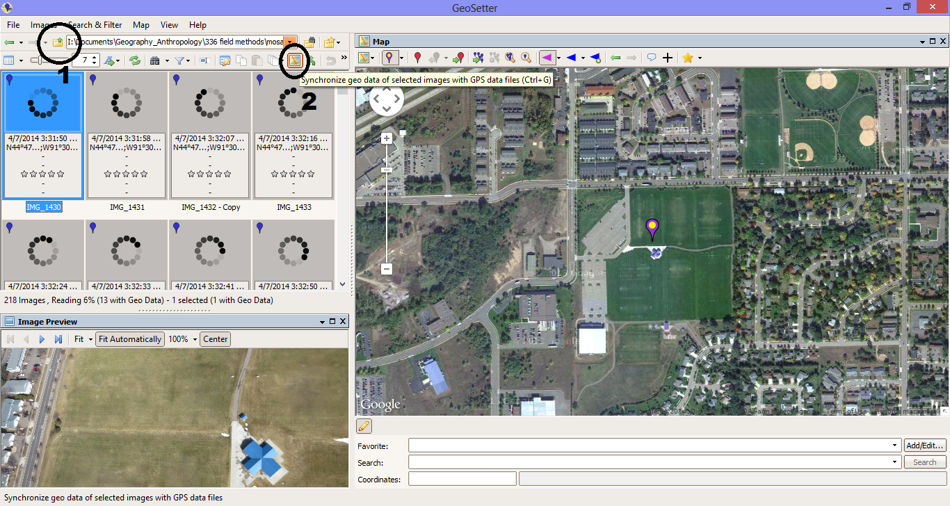
Figure 11. The GeoSetter interface.
 
 
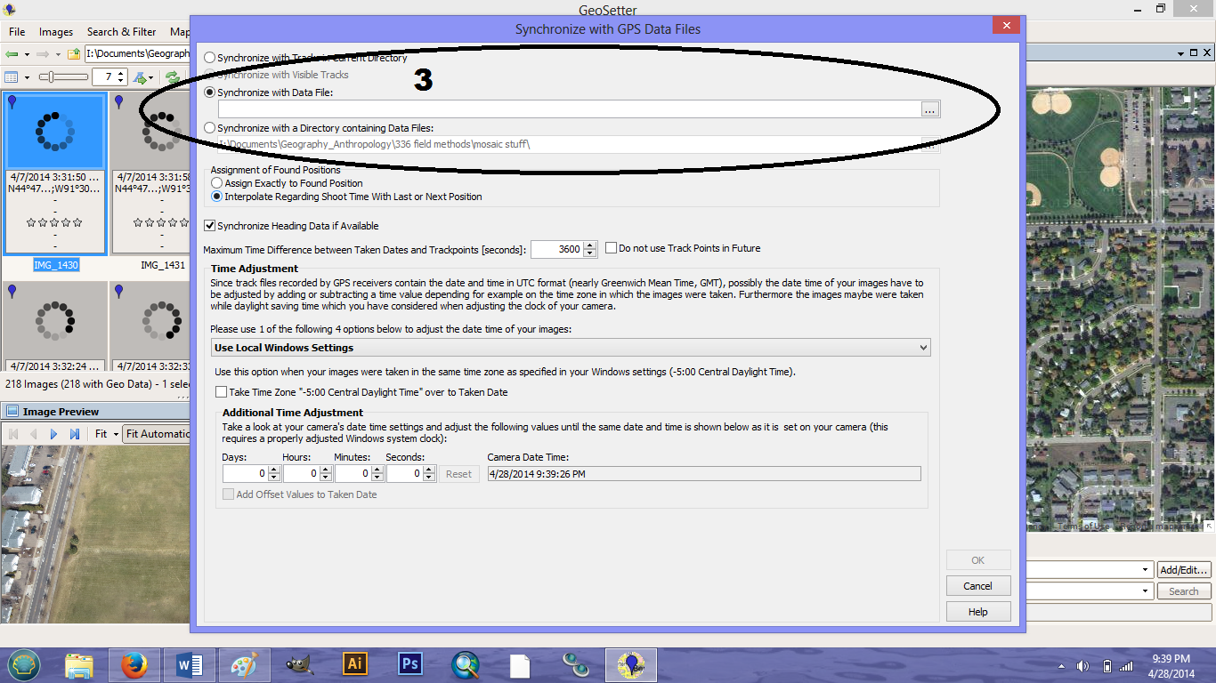
Figure 12. Embedding the tracklog by time into the images.
 
4.   To save the images simply close out of the program. A prompt will ask if you would like to save your changes. Click yes. This will save the coordinates on the images.


Results:

Rotary UAS

Figures 13-15 are images captured during the fixed-wing UAS flight. Obviously, the image quality is less than ideal, but this is not the direct result of camera quality or UAS distortion. Rather, the weather was overcast the day the mission took place. These images could be enhanced if they were needed for something crucial. For our purposes, the images were just to show the capabilities for capturing imagery using the UAS.
 
Figure 13: This figure shows our base of operations at the Eau Claire Soccer Park
 
 
Figure 14: The pavilion serving as our base of operations in the distance is visible in this picture only because the UAS was turning at the time. The camera is set up to capture "straight-down" images of what is directly below the UAS
 
Figure 15: This figure captures class members in the field watching UAS flight. You can see the potential for the UAS to capture patterns on the ground such as the lines on the field in this picture.
 
Balloon Launch/Mosaic

As mentioned in the methods section, a mosaic was created using approximately 200 images from the balloon launch. This was done for each camera. While this took longer to process (roughly 3 hours) the result is an image with higher resolution. If you wanted to, you could use fewer images with the result being a lower resolution image. It just depends on the purpose of your mission.


Our first mosaic image (as seen in Figure 16) had one small problem. Because the images from this camera were not geotagged as the photos were taken during the mission, they were not georeferenced. The resulting image would need to be, effectively flipped over for features to be in their actual location. To fix this, Photoshop was used, and everything was georeferenced in ArcMap.
 
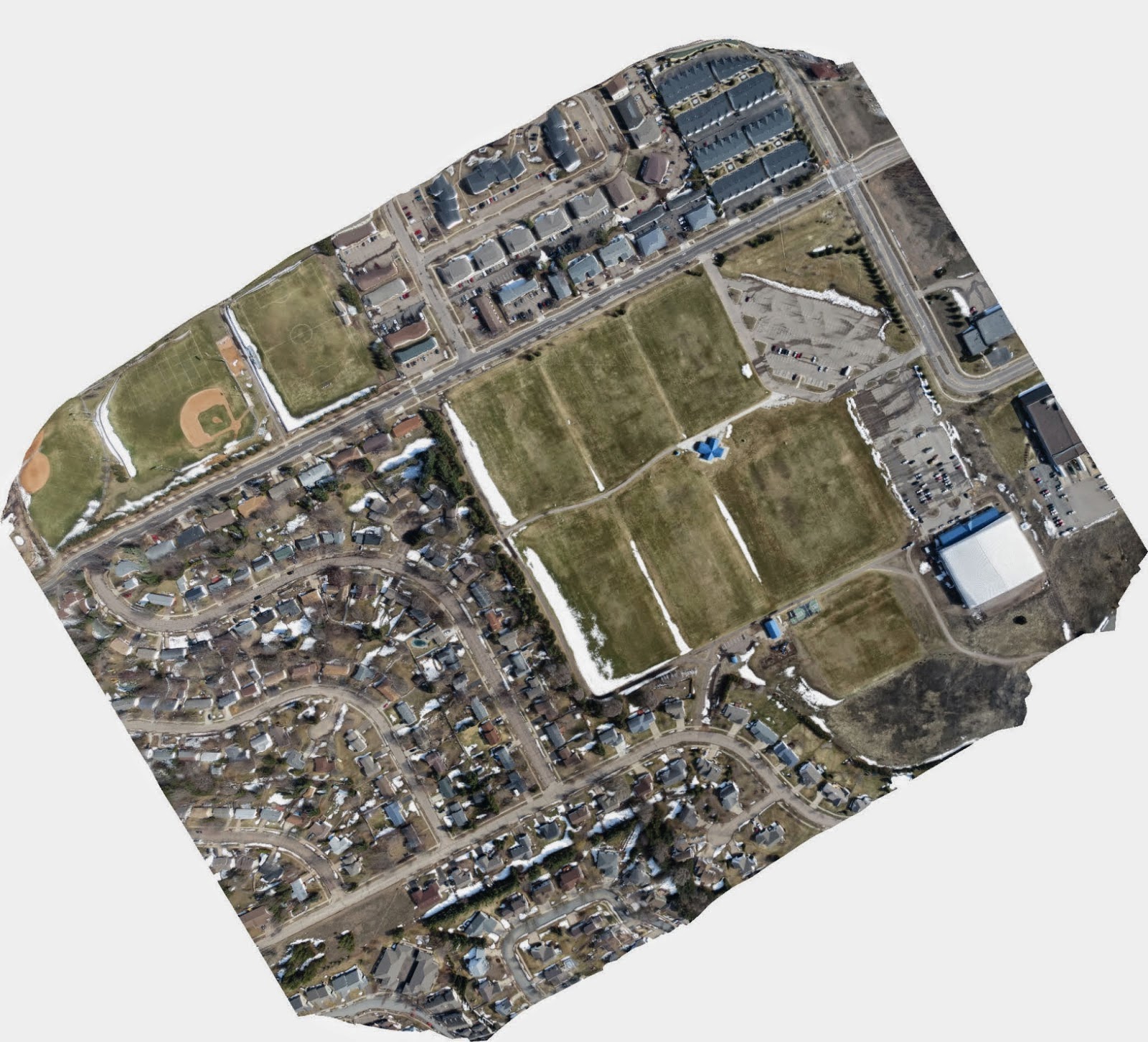
Figure 16: This mosaic image has a completely opposite orientation compared to the actual location of each feature. If this visual could be turned over like a piece of paper, features would be in the correct location.
 
Our second image (as seen in Figure 17) used approximately 180 images from the digital camera that did geotag each image. As a result, the orientation of this mosaic is correct. You will notice this image is quite a bit darker than the first. This could be due to a camera setting or some other aspect of the camera.


Figure 17: This mosaic image was created using geotagged photos from the second camera. As a result, the orientation of this image is correct.


This next image is very interesting; it shows the overlap of the images used in the mosaic. This information is from the camera that was able to geotag images. The more overlap their is, the more likely that the imagery shown is accurate. If you look at figure 17 very closely you will notice a slight increase in distortion on the edges of the images moving from the light blue area out. Most likely this will not be a huge concern unless your project requires a high level of accuracy.
 
The black dots on the map show the exact location where each image was captured from. This would also be a way for you to track the aerial path used to capture images.


 Figure 18: This figure shows the camera locations and image overlap for the mosaic image seen in figure 17
 
 
Finally, a digital elevation model was created of our mosaic image from the geotagged photos. Comparing this image to Figure 17, you will notice the bright yellow patches in the bottom left of this photo correspond to a couple of large buildings, while the dark blue patches correspond to baseball and soccer fields which are generally flat. This model appears to do a reasonable job displaying the elevation data of our study area. No doubt, the inclusion of more imagery would result in an even more accurate representation.
 
Figure 19: This figure is a digital elevation model of the mosaicked image from our geotagged photos.
 

Discussion:

The mosaic process is really not that bad once you have learned the steps. The main thing to keep in mind is that, if your images are not geotagged when they are taken, the resulting mosaic will be a mirror image of actual locations until you georeference them. It would be highly advisable to capture geotagged images if you know the purpose is to create a mosaic.
 
I think most people would have a very difficult time noticing the resulting images from this exercise were anything but a single image. The mosaicking process has the capability to create nearly seemless images of a study area. Perhaps this would be different in an area with greater variation.
 
Only on the outer fringes where there is less image overlap does some minor distortion occur. Without close inspection, the only way this would be noticed is by looking at a DEM. In our DEM the fringes at the bottom of the image seem to indicate a ridge of higher elevation compared to the rest of the photo. This is not the case at all. By simply clipping the image to remove inaccurate areas this problem could be solved if it was a necessary feature of your mission.
 

Conclusion:

As you can see from the few photos shown above, the potential uses of UAS to provide unique data in almost every facet of commercial, industrial, and governmental operations are endless. Going forward, those who take the time to understand how to carry out a successful mission with safety, efficiency, and efficacy will be the beneficiary of lucrative opportunities in this field.  
 
Don't be afraid to think outside of the box when it comes to UAV methods. This is wide open field that has not yet located the best ways to accomplish each kind of mission. There is room for experimentation for those willing to be creative.


Field Activity #9: Topcon Land Survey

Introduction:

In Field Activity #8 data was recorded by building a geodatabase, and deploying it to a Trimble Juno GPS unit. However there a couple of deficiencies with this method. If your project requires a high degree of accuracy, other methods should be employed.

In addition, you do not have the capability to capture accurate elevation data. Field Activity #8 required us to try to ascertain snow depth, but this was done by sticking a rudimentary meter stick down into the snow until it reached ice pack, or ideally, the ground. This method sufficed for our purposes but would not be suitable information for more formal reports.

The Topcon Total Survey Station (as seen in Figure 1) is an ideal surveying instrument for recording preciseelevation data.
Figure 1: The Topcon Total station is a technologically advanced surveying instrument
 
 
For this exercise, my team and I will familiarize ourselves with recording elevation data using a total station along with a handheld GMS-2 system equipped with GPS (as seen in Figure 2).

Figure 2: The Topcon GMS-2 handheld unit is used in coordination with the Total Topcon Total Station

Study Area:

Nestled between several UW- Eau Claire campus buildings, an approximately 1 hectare campus green space (as seen in figure 3) slopes down toward Little Niagara Creek. Our job will be to measure elevation in this general area.


Figure 3: This UWEC green space will be the subject of our Topcon survey. Note that it slopes down toward Little Niagara Creek just visible under the bridge in the left-background

Methods:

Setup
 
It is essential that the Topcon Total Station be stable and level for accurate surveying. First, the tripod legs must be spread out wide enough to provide a very strong base for the heavy total station that will be placed upon it. Next, each leg should be grounded to secure it. To accomplish this, stakes at the bottom of each leg are driven into the ground by pressing on the "ledge" attaches to each stake.
 
Each leg of the tripod can be adjusted as needed to provide a level surface for the Topcon Total Station. The Station is literally attached by screwing it into the tripod with a piece that is removed before and attached after placing the unit onto the tripod.
 
In order to determine whether the total station is level, three circular black knobs at the bottom of the unit (as seen in Figure 4), and corresponding with each leg, are adjusted for calibration. It may be necessary to adjust the legs further to calibrate the total station precisely, as well.
 
 
Figure 4: Basic features of the Topcon Total Station along with circular knobs at the bottom of the unit for calibration to ensure the unit is level


In addition there are three actual levels (similar to the one seen in Figure 5), one for each leg, to provide direction while calibrating.

Figure 5: A level similar to this coordinates with each leg of the tripod to guide your calibration
 
After the unit was level, it was important to record the level from the lens to the ground directly beneath it. This data should be recorded for entry into the GMS-2
 
There is a cover on the total station lens that must be removed - this is a rather easy step to overlook


The Total Station was then turned on, and one more check of the level of the entire system is accomplished by looking at the tilt.

Once this is accomplished, there is a laser plummet that  projects onto the ground, It should be checked to ensure the unit is located in the exact point desired. This is especially important if you have to move the unit and take measurements from more than one location.

After following these steps, it was necessary to turn on the Bluetooth  with the total station. The command process is as follows (Menu--> F4 --> F4 --> F2 --> F4 --> F4 --> F3 --> "Enter" to set).


With the Bluetooth on, a new project was created on the handheld GMS-2 and the ideal coordinate system for the particular zone of Eau Claire we were in was chosen. . Before proceeding we needed to make sure the unit recognized the Bluetooth on the total station.

Back-Site

We were then ready to set our back-site and occupied point. This was done by having a member of our group go to a location holding a prism pole (as seen in Figure 6)

Figure 6: The prism pole used to mark and measure survey points in coordination with the Topcon Total Survey Station

This location and a back-site are essentially "shot and marked" by the total station. In addition, a compass was used to ascertain the azimuth of this initial point and entered into the handheld GMS-2. At this point, the GMS-2 will request information for the height of the total station (as recorded in the set-up process) and the height of the prism pole reflector.

Our recording was as follows:

       Total Station Height: 1.52 m
       Prism Pole Reflector: 2 m
       Azimuth: 322 degrees

Data Collection

Still using the handheld GMS-2 (in the Topsurv Software) we followed the following command sequence (Select --> Topo --> Measure). Now we were prepared to measure.

One member of our group stood at each point keeping the pole as still as possible (as seen in Figure 7) to help with collecting the point and data.

 
Figure 7: Nathan stands with the prism pole marking a survey point
 
 
Another group member stood at the total station peering through the scope to site the reflector on the prism pole (as seen in Figure 8).
 
 
Figure 8: Cody stands at the Total Station siting the reflector attached to the prism pole
 
This group member notified a third member holding the GMS-2 (as seen in Figure 8) when the location has been sited. At this point, 'collect' was selected on the GMS-2. Both the azimuth and elevation of the point in relation to the location of the total station are recorded by the GMS-2.
 
As we went along, the first point marker (Nathan) tried to develop intervals of paces to cover the distance from the top of the slope down to the Little Niagara Creek and beyond. Thus you will notice later in our elevation map the points collected appear to be in sequence. The interval arrived at was 8 steps.
 
116 points were collected in this way within our 1 hectare plot starting from the west and moving in north-south paths By developing a pattern, it allowed us to assure coverage of the campus green space.
 
Data Export
 
After collecting our data points, it was necessary to export the data from the GMS-2 to a computer so the data could be imported into ArcMap for interpolation. Within the GMS-2 use the following sequence ( Export --> To File). Data sets can be exported either as .txt or .shp files. The key it is to make sure both the projection and datum used in data collection is also selected during the export. The delimiter was also set to 'comma'.
 
After exporting the data, we opened it in Notepad just to make sure it was all correctly formatted. Seeing everything looked correct we exported the table which was then opened in Microsoft Excel.
 
Interpolation
 
From Microsoft Excel, our data was added to ArcMap. The Kriging method interpolation was applied to our elevation data to smooth out the area in-between points.
 

Results:

Having applied the Kriging Interpolation, a map was developed displaying our elevation survey (as seen in figure 9). As you can see, the height of elevation is located in the northwest corner and sloped diagonally down to the Little Niagara Creek from there. I think our points are distributed in a way where we can feel fairly confident that the map developed with an interpolation applied is an accurate representation of the elevation surface presented by the UWEC campus green area.


Figure  9: The elevation map developed with the Kriging method interpolation applied shows the slope of the area proceeding down to Little Niagara Creek
 
There are a couple locations where points bunched up; this was most likely due to providing each team member the opportunity to experience each part of the data collection process. In addition, there will some differentiation between the step interval of each person. Had we taken some additional time to map out a desired layout of points we may have been able to provide an even better representation, but looking at the results, it does not appear that our point locations have created any abnormal patterns.

Discussion:

While this process become almost painless once the Topcon Total Station was set up, it was a rather arduous process setting the occupy point. We were forced to forego data collection on our initial day. We ran into more of the same trouble at the beginning of our second day. On the handheld GMS-2, you need to click the 'HTC Set' button when setting up the occupy point. The button simply would not select and would eventually tell us to reboot the Bluetooth on the Total Station. Luckily, the total station shut down for some reason (not intentional). After turning the Total Station back on we were able to click the button to set our occupy point with no further Bluetooth messages.
 
Initially, I had a difficult time settling in on the location of the Prism Pole reflector when looking through the lens of the total station. I really had to settle myself down, focus, and actually take off my glasses before I was able to start zoning in on the reflector.
 
The other problem we ran into was when we exported our data. Both .txt and .shp files would only display the occupy point. For whatever reason the data we were collecting wasn't exporting into the data files even though everything seemed to be taking place as it should when we were in the field. Luckily, Martin Goettl, the geospatial technology facilitator, was able to locate our data and recomputed it.
 

Conclusion:

As is true with any precision instrument, the Topcon Total Survey Station requires preciseness in both set-up and execution of processes. Taking time to familiarize with the steps and reasons for the steps is the key to avoid getting stuck. If you take the time to carefully set up your process, you will eliminate a lot of stress, and help avoid errors leading to smoother data collection. Using a precise instrument is not a guarantee of precise results. It is completely dependent upon the operators executing the proper steps.
 
Also, having good communication between group members and understanding each other's roles can help the process along, and help you cover for one another.


Sunday, April 13, 2014

Field Activity #8: ArcPad Data Collection

Introduction:

The  purpose of this exercise will be to develop maps based on microclimate data collected from the surrounding UW- Eau Claire campus. This data was collected by several different teams of students and pooled in order to build maps with a larger scope of the campus.

A microclimate is used to note the climatic changes of a relatively small area. But even within a small area man-made and geomorphic features cause variations in weather variables.

A gallery of weather variables was developed and built into domains and exported to our Trimble Juno GPS unit in a previous exercise. Now, measurements for these variables will be recorded on a mobile weather station/GPS unit to connect them with spatial locations. Once collected, this data will be transferred to ArcMap where various maps can be produced in order to display the weather variables and variations within our microclimate (the UWEC campus).

Methods:

Data Collection

The Trimble GPS Unit (as seen in Figure 1) containing the domains for our weather variables was use to record measurements and notes based on our field observations. Because each variable is measured in different units, this unit, equipped with pre-set units for each field, allowed us to move as quickly as possible from point to point.


Figure 1: This visual displays a Trimble Juno GPS unit used for collecting field data.
 

A Kestrel Mobile weather station (as seen in Figure 2) allowed us to collect weather observation data such as wind speed, temperature, dew point and relative humidity.


Figure 2: This visual displays a Kestrel Mobile Weather Station for collecting weather variable data
 
 
In addition a meter stick was used to record snow depth, and a compass was used to approximate wind direction.

Data Transfer

After data collection, the data from each team with their various points and microclimate data were merged into one feature class (as seen in Figure 3). While this would ideally be a very easy problem, we hit a snag at this point of the exercise because we had failed to coordinate our attribute table headings.

Figure 3: This map shows the collected point from each team combined into one feature class

Within the merge tool, a field map was used to categorize the different input headings that recorded the same category of data from each group. This made it possible to combine them into one output. To avoid error, we merged the data from one group at a time. This allowed us to avoid the confusion of trying to assure every category was matched properly for seven groups at once.

From there, it was possible to develop maps using interpolation methods offered through ArcMap to
effectively display the data. These methods include spline, kriging and inverse distance weighted (IDW) among others. An entire suite of interpolation methods and their explanations allow users to experiment with and understand the best usages for these methods.

One other problem arose when a few data points were actually locate near the Equator. These points were simply deleted allowing raster design to proceed.


Results/Discussion:


Temperature Map

First, I produced a map of temperature data (as seen in Figure 4). I did not find the original results of the IDW interpolation for temperature to be particularly illuminating. In an effort to try to produce something better, I manually adjusted the class breaks. I chose to use a lot of classes because there really isn't that much differentiation between most of the temperature data outside of a few outliers. This way, I wouldn't be overstating the temperature difference around campus. I am happy that temperatures under 32 degrees stayed in the relatively blue classes on the map. It might seem like an aberration to have values between 45 and 80 degrees when most other values are hovering around 32 degrees. This was due to temperature recording at a point directly beneath a heat vent.

 
Figure 4: This map shows the temperature variation recorded on the UWEC campus
 

Wind Speed and Direction Map

The next variables I interpolated were wind speed and direction (as seen in Figure 5). Using the IDW interpolation on wind speed, I again adjusted the class breaks and applied a single color scheme to help identify where wind speed is increasing more easily.. The trick of this map was how to allow readers to ascertain both variables at the same time. I wanted to indicate the direction of the wind while still allowing them to see the wind speed beneath. I chose to symbolize wind direction with a hollow arrow and adjusted the direction of the arrow based on the direction in the symbolization menu.

I almost made the huge mistake of not pointing my arrows the way the wind is heading which is exactly opposite of what you record when determining wind direction. Luckily, I caught my blunder and made the adjustment. Initially, I wanted to only include one arrow in my legend to avoid redundancy, but after experiencing my own oversight, I realized there might be poepl who would benefit from seeing the arrow associated with each direction.

Obviously buildings wreak havoc with a consistent wind direction flow as can be seen by the arrows pointing in various directions between buildings. I was also intrigued by the wind tunnel seemingly create in the campus mall area.


Figure 5: This map displays the wind speed and direction measurements recorded across the UWEC campus.
 

Snow Depth Map

Displaying snow depth (as seen in Figure 6) may be a little bit sketchy. Without far more measurements than we were able to take, it will be almost impossible to get a clear picture of the snow depth panorama in a built environment. With heavy snows and plowed paths varying constantly in every direction, if the points collected are not tight and regular, the interpolation will attribute smoothing that really shouldn't be there. But, there really weren't enough points taken to just indicate snow depth at each point alone, either. Clearly there are no massive snow drifts in the middle of the Chippew River or literally piled on top of buidlings. Snow depth recordings in a built environment require far more precision than we were shooting for with this exercise.

 
Figure 6: This map displays snow depth based on measurements taken on the UWEC campus
 

Relative Humidity Map

Relative Humidity refers to the amount of moisture in the air. While this is certainly not my area of expertise. The pattern of low relative humidity in most parking lots catches my eye (as seen in Figure7) . I am very intrigued by the high relative humidity on the back-end of Phillips Hall, though I cannot say why this might be unless the data in this area was recorded on a day that was very different from when all of the other data was recorded.

 
Figure 7: This map displays relative humidity data based on measurements taken on the UWEC campus
 
 
Dew Point
 
Lastly a map of dew points was made (as seen in Figure 8). This is another measure of moisture in the air where the closer the dew point value is to the recorded temperature the more moisture is in the air. Most noticeable here is the high dewpoints recorded on the far bank of the Chippewa River.
 
 
Figure 8: This map displays dew point data based on measurements recorded on the UWEC campus


Conclusion:

This exercise is really invaluable from start to finish. I realize how much you aren't thinking of in pre-planning when it comes to how you will record data and potential problems you may face. That is why Dr. Hupy has stressed the taking of notes whenever you are in the field. For whatever reason, he notes field was not in working order. However, this should not have kept us from recording notes. It is essential to accurate data collection.

Also, the snow depth measurements was an eye-opener for me. It is important to consider the environment around and envision how data recording will work for a particular variable. With some forethought, it could have been determined how often we would need to record this in order to produce a valuable map. The data we recorded is insufficient to produce a map document worth its weight in paper.